CapMetro Feature Addition
CapMetro Mobile App Feature Addition & Visual Redesign


The Design Challenge
Our team was tasked with integrating new features into the existing CapMetro mobile application. The current app allows Austin public transportation riders to plan their trips and purchase tickets. However, once a rider is on the bus, the amount of data available becomes virtually non-existent. Our challenge included creating a way for riders to gain visibility into their current trip status.
Project Overview
My primary roles: Project Manager, Sketch Lead, & Interaction Designer
Deliverable: Clickable Prototype
Team: 3 UX Designers
Tools: Sketch, InVision
Duration: 2 weeks
My contributions: Project Planning Timeline, User Interviews, Affinity Mapping, Feature Prioritization, Persona Development, Defining Problem Scope, Information Architecture, Sketching, Task Scenarios, Customer Journey Mapping, Wireframes, Usability Testing, Iterations, Prototyping, & Project Presentation
Research
Before we defined our project scope, we conducted thorough research to ensure we solved for the right problem. Our research included a heuristic evaluation of the existing CapMetro application, a competitive analysis, and interviews with existing Austin public transportation riders and CapMetro users.
Current App
First, we took a look at the existing CapMetro app and some of its reviews. While the app employs a minimalist design and offers riders an easy way to purchase tickets and plan trips, it’s limited in its other functionalities. The current “live predictive map” is cluttered and inaccurate, and the notifications are limited to general service alerts. Further, we concluded that there is weak error prevention in the app as well as an outdated visual design.


Competitive Analysis
For our competitive analysis, we chose to evaluate not only other cities’ public transportation applications, but also other local transportation options that Austinites might choose over taking the bus or MetroRail. Below, I’ve highlighted some of the key categories in which CapMetro falls behind its competitors.

Research Interviews
We conducted interviews with 3 participants, ranging from ages 26-35, each of whom regularly use Austin public transportation and the CapMetro app.
Example Questions:
When do you usually use public transportation in Austin?
What is your process for planning a journey on public transportation in Austin?
Have you ever experienced delays with public transport or ride-sharing? How were you alerted to these delays?
Do you have any frustrations with your public transportation experience?
What do you like about public transportation?
What do you like about ride-share apps?
What kind of information is important for you to have access to with regards to public transportation?
“It’s important for me to have access to accurate ETAs because I use the bus to get to and from work.”
Research Synthesis
We synthesized our research by affinity mapping with post-it notes, and 3 major user frustrations emerged: timing, safety, and alerts.

Research Findings
Riders find that CapMetro is the most affordable and socially-conscious option for commuting to and from work.
A lack of ETA information can be detrimental for professionals and students who rely on accurate data for getting them to their stop on time.
Taking public transportation can make people feel unsafe at times, whether that be caused by other passengers or reckless drivers.
Buses can be unreliable, and there is no way to know if your bus is running on schedule.
Defining the Scope
Persona
Next, we used our research insights to come up with a target persona to guide our user flow and designs. Meet Julia, a 30 year Account Coordinator who works in downtown Austin.

Feature Prioritization
Now that we had a better grasp on our target audience and key persona, we began to narrow our focus further by prioritizing the features that would be included in the app.

Problem Statement and Hypothesis
Now that we had a better understanding of who we were designing for and what key features we wanted to include, we came up with a more defined problem statement and hypothesis.

In addition to our primary problem statement, we recognized the following secondary problems:
Riders need a way to report any issues that may arise on their trip, whether that be with their driver, their physical bus, or suspicious activity with other riders. In addition, riders need to be alerted to delays, because oftentimes the bus is not running on schedule.
We hypothesized that by creating a “Report a Problem” feature and a way to subscribe to specific routes, we will help riders both feel safer using public transportation and stay updated on accurate time tables.
Developing a Solution
Sitemap and User Flow
We started by making a sitemap and user flow to hone in on certain ideal paths our users would take. We wanted to address each of the needs we uncovered in our research, so we developed paths for our users to view their ETA, share their location, report a problem, and subscribe to alerts for specific routes.


Sketches
Finally we began developing our screens. My team and I started by conducting a design studio to create some preliminary sketches.


Initial Wireframes
I used the sketches from our design studio to create low-fidelity wireframes and a clickable prototype for our first round of usability testing. Below I’ve highlighted some key screens.
Usability Testing
For our usability testing, we gave 4 separate participants a set of task scenarios to walk through. The goal with these tasks was to test each of the new features we added—the ability to track your ETA and share this information with others, the ability to report a problem, and the ability to subscribe to alerts for specific route delays.

Findings
In our usability testing, we uncovered couple of pain points:
On the ETA screen, many of the users did not realize that they could scroll to find the “Share your location” and “Report a problem” buttons
Users were confused about the meaning of “Subscribe to routes,” and some of them didn’t find it intuitive to press on the Alerts icon in the top right of the screen.
Users were unable to find their stops.
Some users were unsure if the numbers on the “Routes” screen were bus numbers or simply list numbers.
Going forward, we knew we wanted to iterate on all of these areas to make the app as intuitive for the user as possible.
Delivering the Product
Style Guide
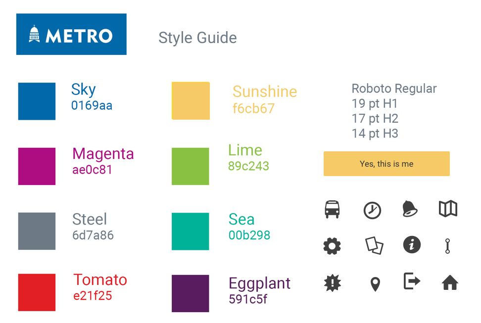
The current visual design of the current CapMetro app is lacking and out-dated. However, the CapMetro desktop site is considerably more visually appealing in terms of typography and color. We modeled our style guide off of the desktop site to maintain consistency and boost the mobile app’s aesthetic.

Final Screens with Iterations
Finally, we were able to use the data we gathered in our usability testing to iterate on our wireframes and come up with a final design to put into prototype. Some of our iterations included:
Slightly shrinking the map on the ETA screen and making the top of the “share location” button more visible so users know to scroll.
Adding visual details to the “select your stop” screen.
Adding a prompt and changing the language of the Alerts screen button from “Subscribe to routes” to “Add/Remove routes.”
Adding “Route alerts” menu option to the Hamburger menu.
Adding the word “Bus” in front of the bus numbers on the Routes page.
Making option to report an emergency differentiated from other buttons.

Hi-Fi Prototype
See the prototype in action by watching the video to the right.
Retrospective and Next Steps
This project greatly contributed to my development as a designer, as I was able to put into practice each aspect of the holistic and iterative UX design process. I was especially surprised by the caliber of feedback we received from our usability testing, which ultimately helped me better understand its value. If there’s one big takeaway from the project, it’s “I am not my user,” a mantra I will continue to both reflect on myself and advocate for in professional settings.
I believe my team and I adequately solved for our design challenge. If our features were to be implemented into the CapMetro app, they would make the public transportation experience easier and safer for Austin riders. If we had more time, we’d like to explore the following next steps:
Incorporate a push notification when desired stop is near.
Track the bus/train as it approaches.
Build out “no, not quite right” path.
Add color-coded traffic patterns.
Add option to name your routes.
Add walking directions from drop off stop to destination.


