Moolah Mobile App Creation


The Design Challenge
My team was tasked with creating a mobile app for Moolah U, an Austin-based company dedicated to teaching children financial literacy. Moolah U currently offers business summer camps for kids, an apprenticeship program, and online family learning resources. The client came to us with an idea for a mobile app that would allow parents to responsibly give their children money through categorized spending buckets, ultimately promoting budgeting skills and financial autonomy in children.
Project Overview
Deliverable: Clickable prototype of parent on-boarding process and key app functionalities.
Duration: 3 weeks
My primary roles: Information Architect, Interaction Designer
Tools: Figma, Principle
Team: 3 UX Designers
My contributions: Project planning timeline, affinity mapping, persona development, defining problem scope, information architecture, wirefreaming, task scenarios, usability testing, iterations, prototyping, visual design, animations, stakeholder presentation
RESEARCH
Validating the Need
In our online research & the data given to us by stakeholders, we uncovered some telling statistics about financial literacy:
Consumer debt is 56% higher than 10 years ago
48% of millennials have to borrow money to make their cash last through the end of the month.
Of these, 17% took a loan from their retirement accounts
We also uncovered data supporting the need for a Moolah U app. Of the 11 million families in the US with children 18 and under, 58% currently avoid talking to their kids about money. However, 75% of parents think that financial apps are a good way to teach kids about money (T. Rowe Price 10th Annual “Parents, Kids & Money” Survey, 2018).
Competitive Analysis
Next, we examined the competitive landscape to better understand some of the key features in financial apps for parents, kids, and teens.

Research Interviews & Affinity Mapping
Next, we conducted user research to identify specific user needs and desires. Our research participants included parents of children aged 10 and up, and we employed the following methods:
Guerilla research for in-person interviews
Phone interviews
Online survey
“I would absolutely find it beneficial to have some structures in place to help my child categorize their spending needs—I’m an adult and I need that!”


In our affinity mapping, some major themes emerged: child autonomy, money as a reward system, parental influence, education, budgeting, and the importance of saving.
Going forward, we wanted to use this data to create features that effectively support families’ needs, such as:
Parental suggestions & visibility
Requesting chores
Separate portals for parent & child
Embedded education & tips
Child’s ability to make spending & budgeting decisions
Automatically putting at least 10 % of transfers into savings bucket
Defining the Scope
Personas
We used this data to create target personas. Meet Beth and her 15 year old son Timmy.

Problem and Solution Statements
After conducting our research and determining who we’d be designing for, we honed in on more a more defined problem and solution.


Developing a Solution
User Flow and Site Map
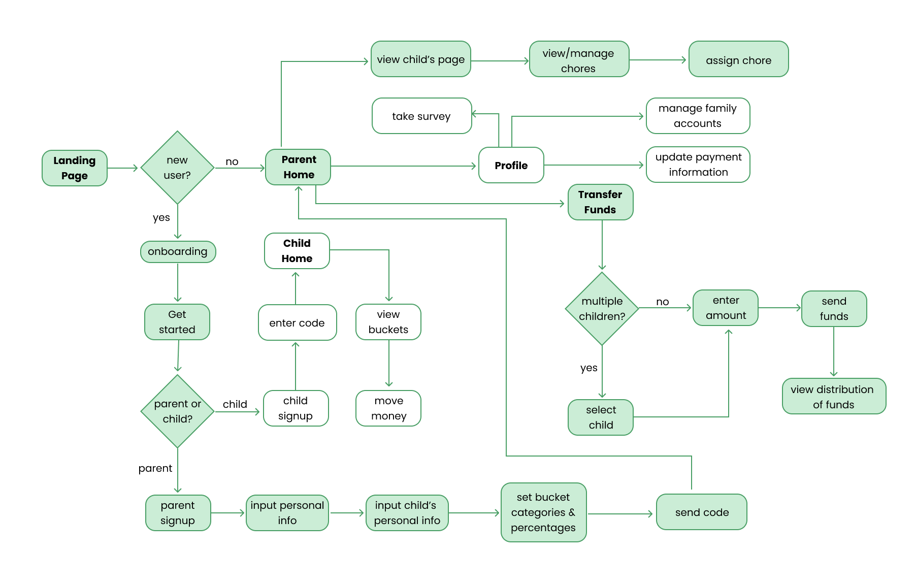
We decided to focus on the parent on-boarding process of the Moolah app. Before creating our screens, we envisioned the information architecture and the ideal paths users would take to accomplish key tasks.


Initial Wireframes
We began developing our screens by creating some initial low-fidelity wireframes. I’ve highlighted a few key screens below.
Usability Testing
Next, I turned the screens into a working prototype to test with potential Moolah app users. We tested the following task scenarios with 5 sets of parents:

Usability Test Findings
Users need to understand why they are asked for sensitive information during the on-boarding process
Users want to have the ability to make savings more than 10%
Users had trouble locating child’s pages from the Home page
Users want to ensure they are able to see not only their child’s buckets, but also what their child is actually spending their money on
Users were confused about drop-down menu to select child while transferring money
Iterations
We made numerous iterations to our wireframes based on our test findings and continued to iterate throughout the development process. Below are a few examples of early iterations.


Delivering the Product
Style Guide
Before creating our high-fidelity mockups, we created a specified style guide on which we’d base our designs and pass to developers.

Final Screens
Below are some examples of our final visually-designed screens.
Prototype
View the clickable prototype on Figma or watch the video below to see the prototype in action.

Retrospective and Next Steps
This project helped me develop my collaboration skills, whether that be working with clients or other designers. Further, I had the opportunity to utilize the entire holistic and iterative UX process. I especially enjoyed getting comfortable with new softwares—namely Figma (for wireframes, mockups, and prototyping) and Principle (for animations). If we had more time, my team would explore building out the child portal of the Moolah app, in which children could move money from bucket to bucket and request chores.


